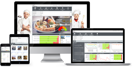
Many companies struggle to have a centralized view of their customer experience data. Often companies receive “Data Dumps” from multiple sources each showing only one piece of the puzzle. The process of organizing and consolidating this data into a single management spreadsheet is time consuming and error prone. Elite CXS’ reporting technology lets you see all your customer experience data under one umbrella including mystery shopping, audits, customer surveys, employee surveys, reviews, social media, company listings, competitive benchmarking, insights and ticketing. Every user is empowered with the tools they need to improve performance on their desktop or mobile device from the location level to district to region and companywide.

Many companies struggle to have a centralized view of their customer experience data. Often companies receive “Data Dumps” from multiple sources each showing only one piece of the puzzle. The process of organizing and consolidating this data into a single management spreadsheet is time consuming and error prone. Elite CXS’ reporting technology lets you see all your customer experience data under one umbrella including mystery shopping, audits, customer surveys, employee surveys, reviews, social media, company listings, competitive benchmarking, insights and ticketing. Every user is empowered with the tools they need to improve performance on their desktop or mobile device from the location level to district to region and companywide.
Every user is empowered with the tools they need to improve performance on their desktop or mobile device from the location level to district to region and companywide. Company executives and managers can view data across the entire enterprise and quickly drill down into site specific information. Store managers and individual franchisees can view data for their specific location and can compare their performance at the regional or corporate level. Standardized and customizable reporting is available to enable you to see the data and comparisons the way you need to.
Voyager and TrueVoice CX are the heartbeats of our solutions. Customized and integrated dashboard style landing pages consolidate the key data you need to monitor, measure and manage your business in one easy view.
Voyager
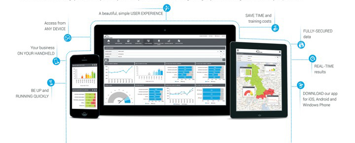
Elite CXS’ Voyager is a powerful analytics tool that brings your results to you on any device on your schedule: while traveling, waiting for your next meeting or as soon as they are published.

Voyager
Elite CXS’ Voyager is a powerful analytics tool that brings your results to you on any device on your schedule: while traveling, waiting for your next meeting or as soon as they are published.
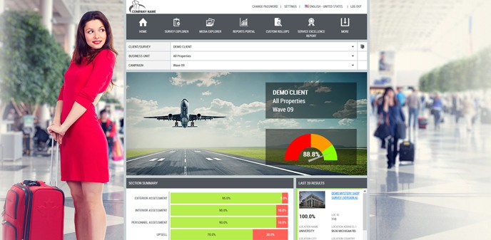
Voyager’s Welcome Page is the ideal place to get a comprehensive view of your Overall Business performance with a single click. The dashboard is specially designed to present data aggregated to the highest level at a glance. You can immediately see the overall and section scores of the campaign plus keep track of the trend of your location results.
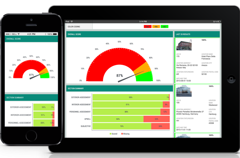

Voyager’s Welcome Page is the ideal place to get a comprehensive view of your Overall Business performance with a single click. The dashboard is specially designed to present data aggregated to the highest level at a glance. You can immediately see the overall and section scores of the campaign plus keep track of the trend of your location results.
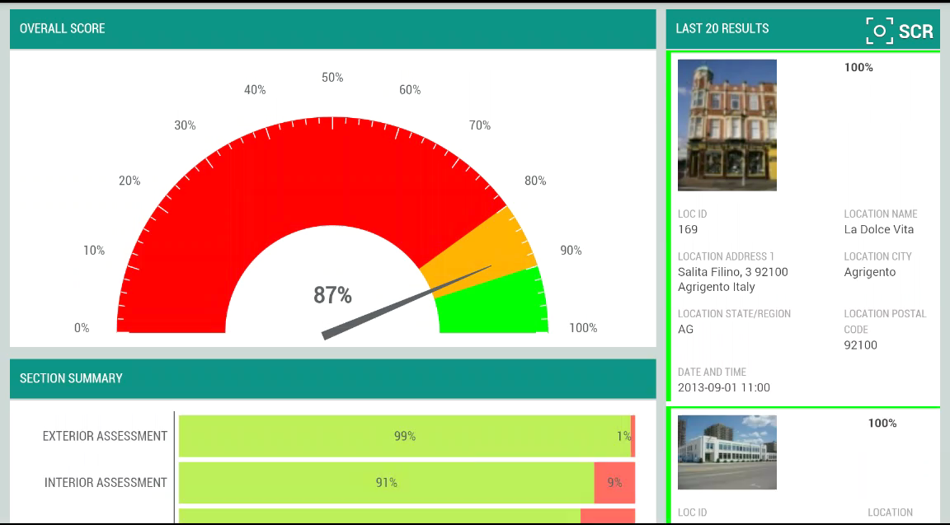
From the Voyager Welcome page, you can easily:
- Filter for the Survey, the Business Unit and the Campaign for which you want results to be displayed.
- Display overall scores based on the selected filters
- Visualize the Section Summary Snippet; a comparative table showing all the sections for with results. Here you can filter down the result with a single interaction on the screen. You can filter by any sectional result by clicking on it. When you click on the Filter, the results for that particular section will be displayed.
- View the overall scores by each Campaign.
- See the last 20 results and easily drill down to view the full survey details
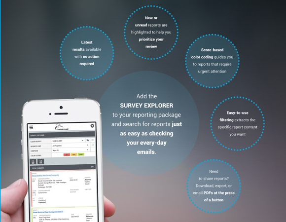
Voyager’s Survey Explorer feature gives you speedy and effortless access to the details. You can search through the list of completed surveys with the latest results available with no action required.
- Filter for the Survey, the Business Unit, the Campaign, specific questions and the location(s) for which you want results to be displayed.
- Efficiently browsing through collected data is of key importance when managing mission critical operations. Filtering with the highest level of detail is easily doable by using multiple parameters. You can review each report by simply clicking on it
- Ordering and sorting visualized instances with only one click saves you valuable time and effort. You can sort the instances according to your needs.
- Download, export or email PDFs with a single click/tap
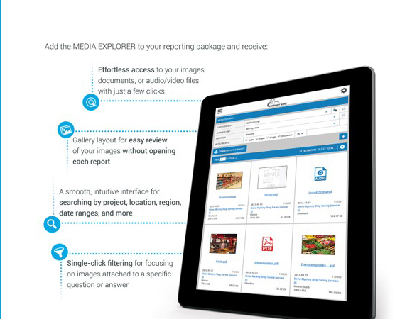
Voyager’s Media Explorer feature provides the ability to effortlessly locate and track your images, documents or audio and video files with only a couple of clicks. You can easily compare and track changes over time.
- Filter for the Survey, the Business Unit, the Campaign, attachment type (Audio, Video, Image and Document) and the location(s) for which you want results to be displayed.
- You can easily define how many attachments to be displayed in each page by using the dropdown menu of the Attachments per page option.
- You have the ability to preview the attachments by simply clicking on a certain document or image and then moving to the next or previous one by clicking on the arrows buttons in the Gallery Viewer. This way, you will not be forced to click on a picture to enlarge it and then close it and open a new one.
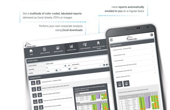
With the combination of the three fundamental data presentation components in one report from Voyager’s Report Portal – tabular, chart and color coding, you benefit from the enhanced visualization and dramatic time savings in reading and understanding reports. You no longer have to expend effort reading and interpreting data, our reports do this for you. With over 15 customizable and configurable reports covering all aspects of organizational performance, including trending, ranking, survey, question and answer analysis, verbatim and exceptions analysis you are guaranteed to have a thorough view of your performance at any point in time and business dimension. In addition to these, fully customizable reports can be created based on your specific required data points and easily displayed for you.

With the combination of the three fundamental data presentation components in one report from Voyager’s Report Portal – tabular, chart and color coding, you benefit from the enhanced visualization and dramatic time savings in reading and understanding reports. You no longer have to expend effort reading and interpreting data, our reports do this for you. With over 15 customizable and configurable reports covering all aspects of organizational performance, including trending, ranking, survey, question and answer analysis, verbatim and exceptions analysis you are guaranteed to have a thorough view of your performance at any point in time and business dimension. In addition to these, fully customizable reports can be created based on your specific required data points and easily displayed for you.
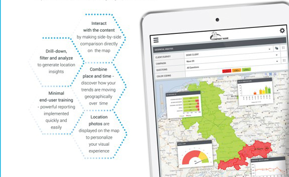
Voyager’s Geospatial Analysis gives you the full picture and puts your business data on the map.
Almost all business data has a geo-location reference aspect.
With Geospatial Analysis you can quickly relate data to locations that are meaningful to your business and detect geographical trends.

Voyager’s Geospatial Analysis gives you the full picture and puts your business data on the map.
Almost all business data has a geo-location reference aspect.
With Geospatial Analysis you can quickly relate data to locations that are meaningful to your business and detect geographical trends.
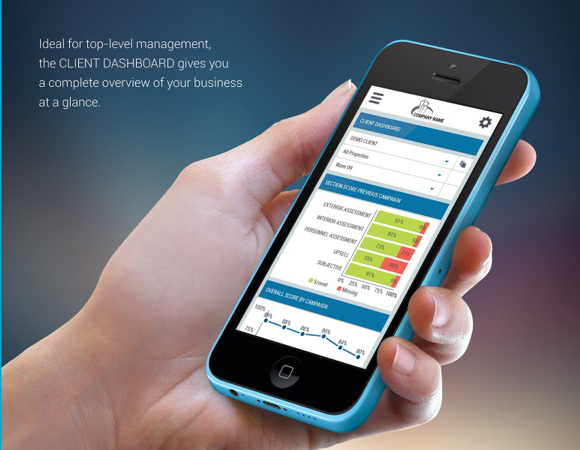
Voyager’s customizable Client Dashboard delivers a powerful visual presentation of multiple performance indicators at a glance. With its ability to quickly provide a comprehensive view of the “big picture” with a single click, the Client Dashboard is the perfect tool for top level managers. #
Chose from over 40 different snippets that can be displayed on your dashboard. This dashboard is customizable by user ensuring each ensuring that each team member quickly sees the data and results most important to them.
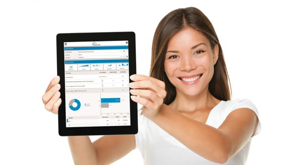
Voyager’s Answer Distribution Analysis gives you complete analytics with unparalleled visualization. Instantly ASSESS DATA STREGTH AND VALIDITY on multiple levels with BUILT-IN INDICATORS:
- Sample size indicator
- Response rate indicator
- Answer distribution indicator
- Statistical error indicator
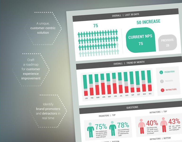
Voyager’s Net Promotor Dashboard gives you the ability to identify brand promoters and detractors in real time. Create exceptional customer experience.
- Get Overall NPS score for the last 30 days and comparison between the current and the previous period.
- Trend of Promoters, Detractors and Passives a year back by month.
- Indicate the top questions for detractors and promoters.
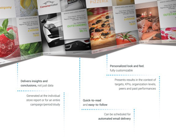
Voyager’s Aggregate Service Excellence Report is the one report with all the relevant data. It is designed to be delivered at different organizational levels – regional managers, area managers, unit type, etc. Its main objective is to deliver comprehensive and easy to follow and read performance analysis, by displaying the performance results in the context of organizational objectives, past performance and in comparison with peers.
It also identifies the most critical performance areas (Attention Areas) and explains how focusing on these areas will affect overall results. The report can be scheduled for automated email delivery at a certain date, or after all jobs within the organizational level are completed. The Aggregate Service Excellence Report is fully customizable, to match your corporate style.
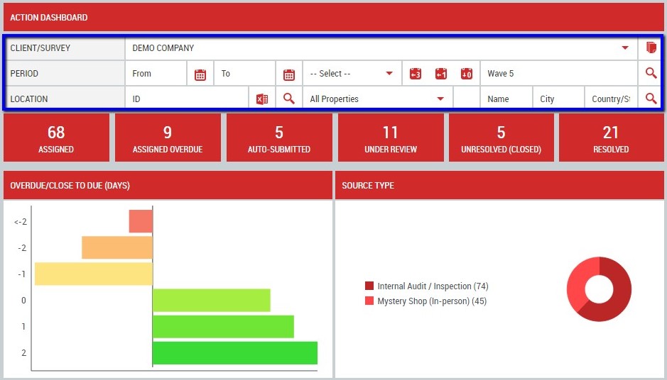
Voyager’s Action Dashboard lets management keep track of important goals and KPIs and ensures that actions are being taken to improve business performance. The Action Dashboard displays the following Progress Status KPIs:
- Assigned – displays the number of assigned Action Plans which Due Date have not passed yet.
- Assigned Overdue – displays the number of assigned Action Plans which Due Date have already passed.
- Auto-Submitted – displays the number of automatically submitted overdue Action Plans.
- Under Review – displays the number of completed Action Plans that are pending validation.
- Unresolved (Closed) – displays the number of completed Action Plans that are marked as unresolved. The system considers as unresolved each completed Action Plan which score is different from 100%.
- Resolved – displays the number completed Action Plans that are marked as resolved. The system considers as resolved each Action Plan which score is 100%.
- Resolved (Auto-Submitted) – displays the number of auto-submitted Action Plans that are marked as resolved.
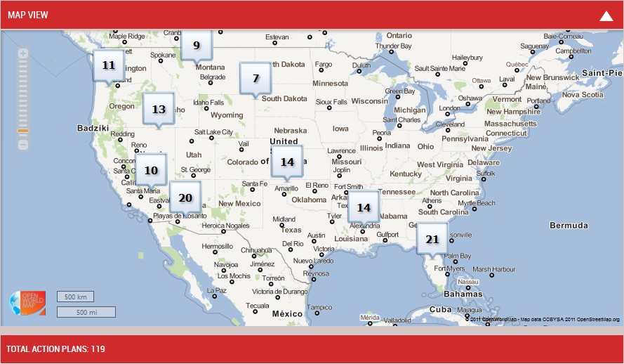
The “Map View” snippet in Voyager’s Action Dashboard gives you the ability to review the Action Plans distribution on a map. The number of Action Plans for each location (or cluster of locations) is displayed on the map.
You control the zoom level of the map by using the map slider and the “Map View” allows you to review the Action Plans for a specific selection by clicking on the desired Location (Clusters) directly from the map.
The selection will be colored in orange and the list of all Action Plans for the corresponding location (cluster) is displayed in the “Total Action Plans” list.
TrueVoice CX
Our TrueVoice CX platform provides you with the most powerful tool in the industry to effectively monitor, measure and manage all your voice of customer touchpoints from one consolidated dashboard. Monitor and manage reviews, surveys, listings, social media, ticketing, insights and competitive benchmarking with ease.
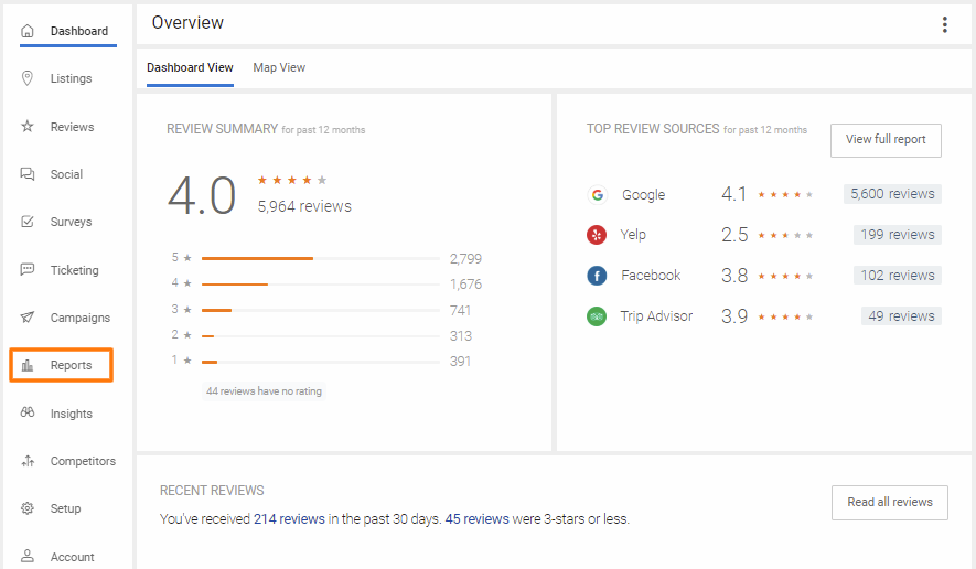
TrueVoice CX provides you with a robust report management system which helps you get better insights into the data aggregated into your account. You can view data pertaining to reviews, platform usage, visitors, and more. The Reports tab is accessed from your Dashboard which displays pertinent snippet data for each reputation management component.
Review & Rating Reports
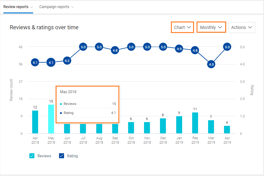
‘Review & Rating’ reports are sorted under ‘Over time’, ‘By source’, ‘By location’, ‘Leaderboard’, and ‘Visitor report’.
The ‘Over time’ report helps you analyze the total number of reviews with their average rating for a defined period. The ‘Over time’ report can be viewed both in ‘Chart’ and ‘Table’ format. To get detailed data for any period, just hover over any bar on the graph. This will give you the total number of reviews and the average star rating of the reviews represented by the bar. You also have the ability to view data on ‘Yearly’, Quarterly’, ‘Monthly’, ‘Weekly’, and ‘Daily’ basis. The reports can also be easily downloaded to pdf’s or emailed to you.
The ‘By source’ review report displays the average rating received from the different review sources. The top compartment lists the ‘Review summary’ for all the review sources.
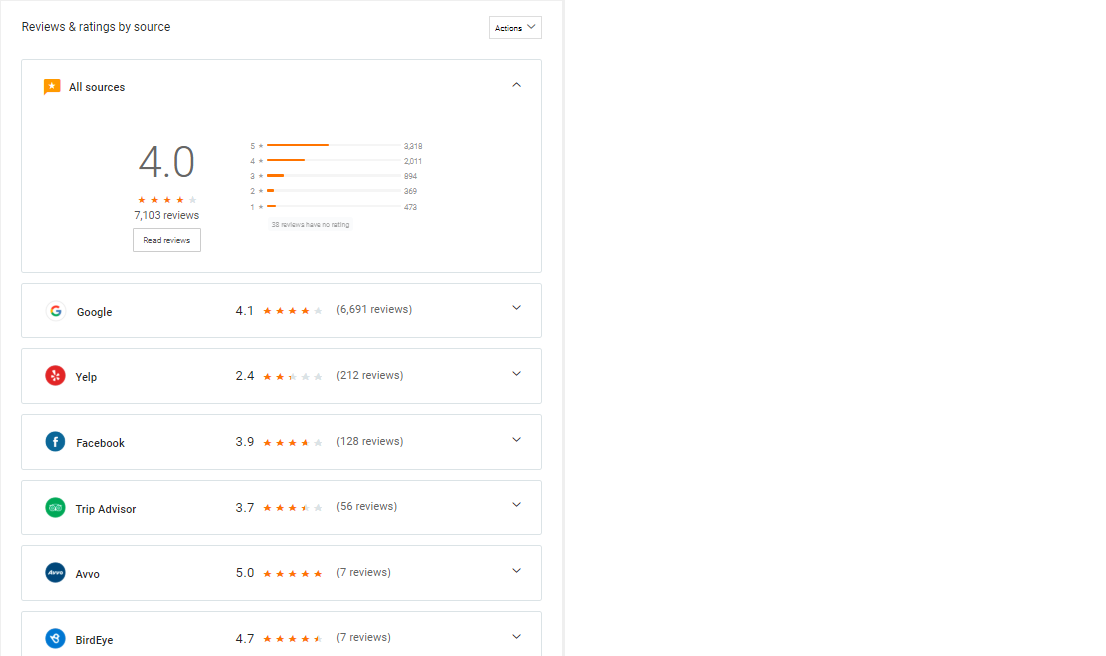
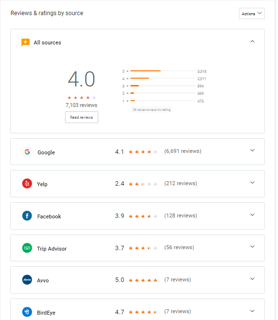
The ‘By source’ review report displays the average rating received from the different review sources. The top compartment lists the ‘Review summary’ for all the review sources.
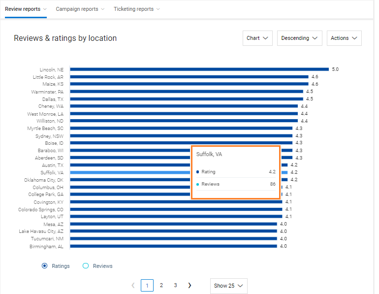
The ‘By location’ report displays the same information for all locations. This report is available in both ‘Chart’ and ‘Table’ formats.
The average review rating with total reviews for a specific location can be obtained by hovering over the bar indicating the location. NOTE: ‘By location’ reports are available for enterprise customers only.
Employee performance and employee behavior can greatly impact the growth trajectory of your company. Therefore, it becomes highly important to track employee performance for continued business growth. Customer feedback-oriented employee performance allows you to incentivize/reward your employees when they do well and can be a great training opportunity when they don’t. With TrueVoice CX, you can efficiently monitor the performance of all your employees based on the number of review requests sent and the customer feedback received.
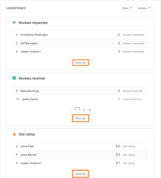
By default, you will see the ‘Chart’ view of the ‘Leaderboard’ page. You can view the performance of employees under the sections: ‘Reviews requested’, ‘Reviews received’ and ‘Star rating’. To view the performance of all employees, expand the list of employees in a particular section by clicking on the respective ‘Show all’ buttons.
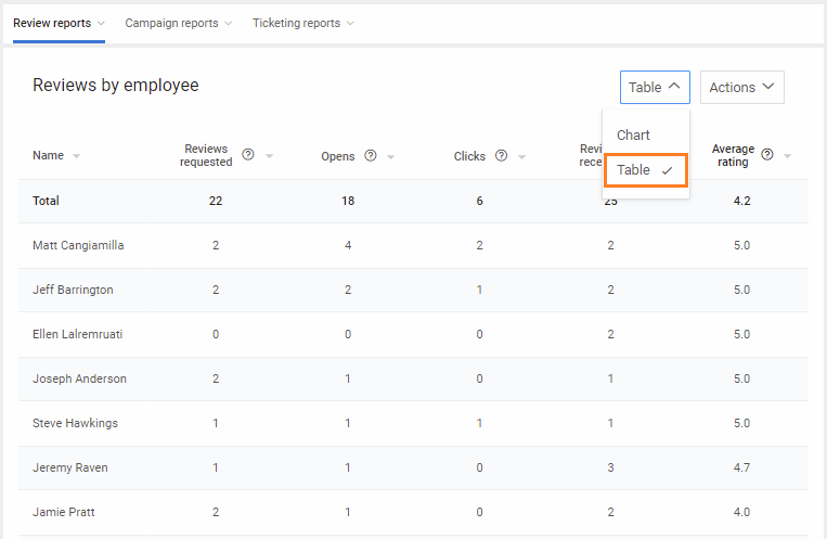
The ‘Leaderboard’ can also be viewed in tabular format.
On this page, you will be able to view the performance of employees under the categories: ‘Reviews requested’, ‘Opens’, ‘Clicks’, ‘Reviews received’ and ‘Average rating’. Reports can also be downloaded to pdf’s or sent via email.

The ‘Leaderboard’ can also be viewed in tabular format.
On this page, you will be able to view the performance of employees under the categories: ‘Reviews requested’, ‘Opens’, ‘Clicks’, ‘Reviews received’ and ‘Average rating’. Reports can also be downloaded to pdf’s or sent via email.
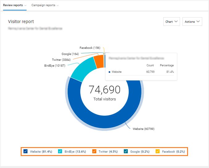
TrueVoice CX gives you the ability to automatically promote your reviews on the integrated social media channels, TrueVoice CX review profile, and your business website. Once the reviews have been promoted, TrueVoice CX tracks the total number of visitors who have read your reviews on the different channels and displays the results on the Visitors Report.
The ‘Graph’ format displays the number of visitors across multiple channels in a donut chart. The report also highlights a percentage distribution of visitors across social media channels and the TrueVoice CX review profile. Hovering over the graph will show the count and percentage of visitors from a particular source. The report can also be viewed in a tabular format and by multi-location comparison.
Relative Location Rank Reports
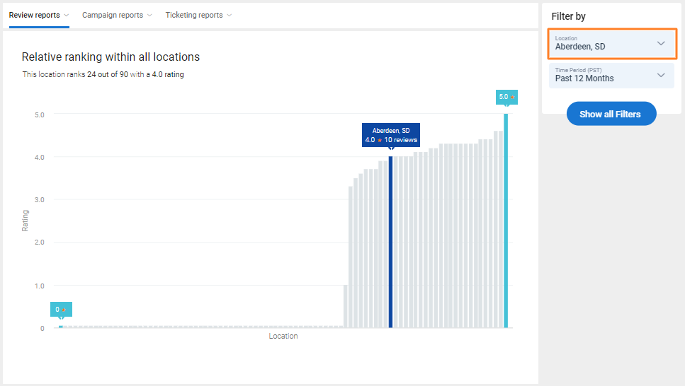
The report on ‘Relative location rank’ helps businesses to understand how different locations stack up against each other. This report is available for enterprise customers only. The ‘Relative location rank’ report will display the selected location in ‘Blue’ with the rank and the rating summary on the top.
Average Response Time Reports
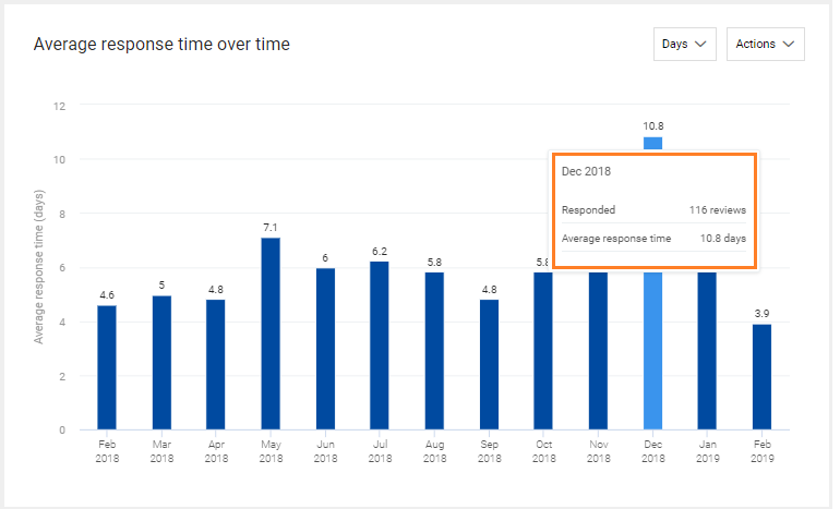
The ‘Average response time’ reports give you the ability to track the average amount of time it is taking for your review responses. These reports are sorted by ‘Over time’, ‘By location’, and ‘By owner’.
The ‘Over time’ report helps you analyze the average response time for a defined period.
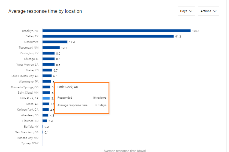
The ‘By location’ report displays the average response time for all the business locations.
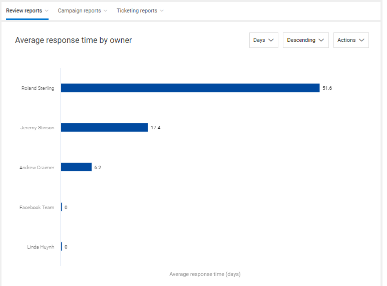
The ‘By owner’ report displays the average response time for each business owner added to the TrueVoice CX account.
NPS Reports
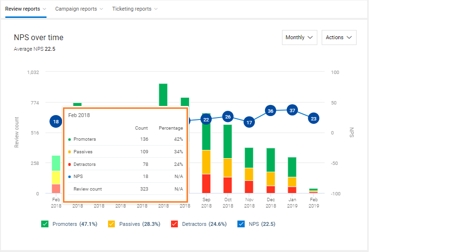
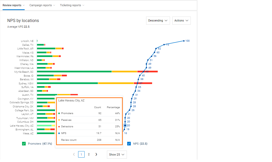
The fourth category under ‘Review reports’ is the ‘NPS’ category. ‘NPS reports’ are sorted under ‘Over time’, and ‘By location’ categories.
The ‘Over Time’ NPS report helps you analyze the review customer sentiment for a defined period. The data will be visible in terms of ‘Promoters, ‘Detractors’, and ‘Passives’. Hover over any bar to read the statistical data for ‘Promoters’, ‘Passives’ and ‘Detractors’ over a period of time. You can also view the total percentage of ‘Promoters’, ‘Passives’, and ‘Detractors’ below the graph. If you wish to view the report for a single category, you can uncheck the corresponding boxes for other categories.
The ‘NPS by locations’ report displays the sentiment summary for any selected location. If you wish to view the report for a particular location, hover over the graph. You can view the ‘Promoters’, ‘Passives’, and ‘Detractors’ data in terms of ‘Count’ and ‘Percentage’.
Tag Reports
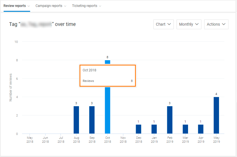
The last category under ‘Review reports’ is the ‘Tag reports’, which shows the information on review tags. Tag reports are sorted under three categories: ‘Over time’, ‘By count’ and ‘By location’.
The ‘Over time’ option allows you to view the tag data aggregated over time. TrueVoice CX offers two views of ‘Tag reports’: ‘Chart’ and ‘Table’. You can also email the reports to one or more users and download the reports in two formats: ‘PDF’ and ‘Excel’. When you select a tag and hover over a bar on the graph, you can view the number of reviews the tag is associated with over a particular period of time.
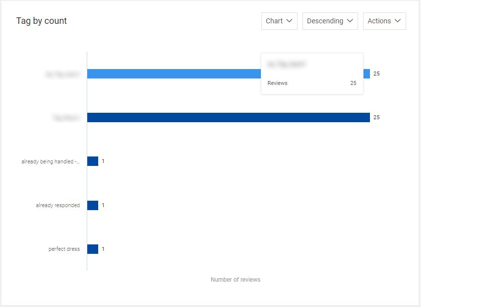
The ‘Tag by count’ report shows the number of reviews a tag is associated with. Just navigate to the tag for which you want to view the report and hover over the bar associated with it to view the review count.
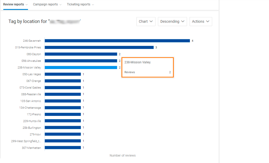
The ‘Tag by location’ report shows the number of reviews associated with a particular tag at a given location and is available for enterprise accounts only. To view the review count for a location, navigate to the location you want and hover over the corresponding bar.
Campaign Reports
Customer satisfaction is vital for the growth of any business. You must keep yourself informed about what your customers say about your products or services. TrueVoice CX allows you to measure your ROI through campaign reports.
The ‘Campaign reports’ are classified into two categories: ‘Review request’ and ‘Customer experience’.
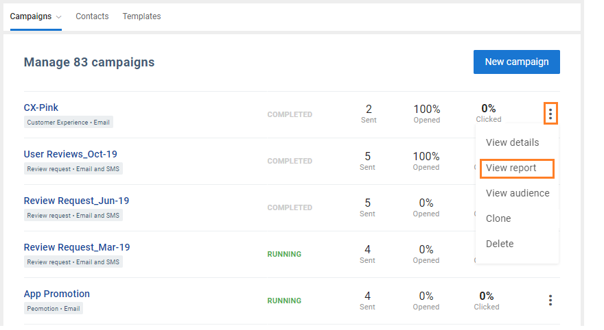
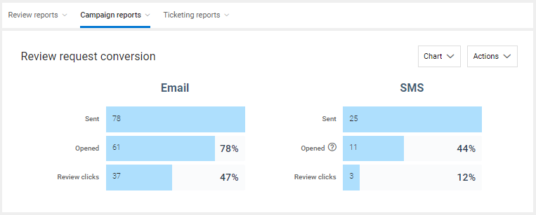
The ‘Review Request Conversion’ reports are categorized into two sections: Email and SMS. Both the categories show the number of Emails/SMS ‘Sent’, ‘Opened’, and ‘Review clicks’. The report can be viewed in chart or table format.
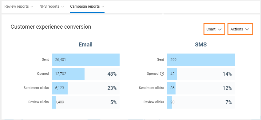
TrueVoice CX offers four different types of Customer Experience reports associated with Campaign management:
- Customer experience conversion funnel – This report shows data in terms of numbers as well as percentages. It has two funnels – Email and SMS, and both the funnels show data for the following data points:
- Sent
- Opened
- Sentiment clicks
Review clicks
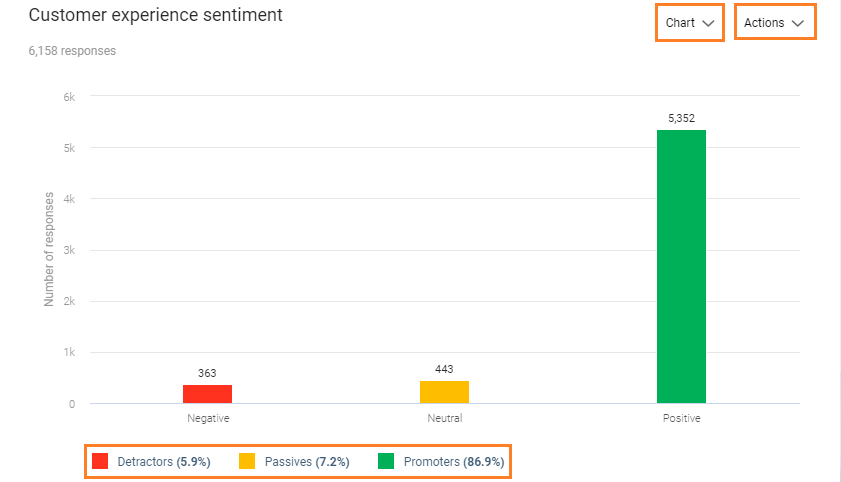
Customer experience sentiment – The default view of this report shows one of the 3 distribution charts, based on the type of question used in the CX template (NPS, Sentiment or 5-star). It is also based on the template settings used for check-in. It shows the count and percentage of positive, negative and neutral responses received through email and SMS, and can be viewed in graphical as well as tabular formats. You can view the percentage of Promoters, Passives, and Detractors below the graph.
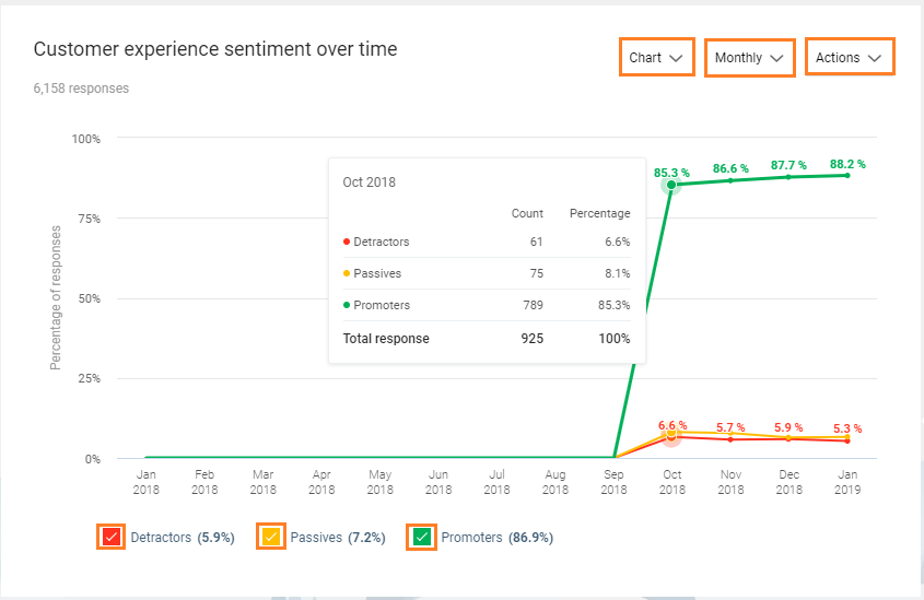
Customer experience sentiment over time – This report is based on NPS data over time. The default view of the graph shows the monthly data for Promoters, Passives, and Detractors in terms of numbers and percentage.
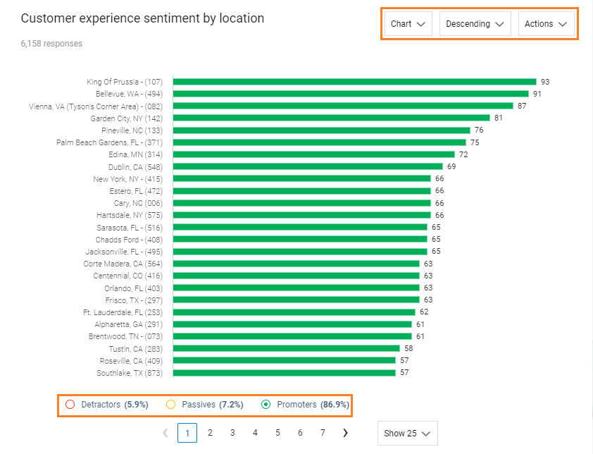
Customer experience sentiment by locations (Enterprises only) – This report shows the NPS data for locations. By default, the graph shows the data for Promoters. The graph can easily be switched to view the data for Passives or Detractors.
Survey Reports
TrueVoice CX provides deep analytical tools and reports to give you insights into the customers’ thoughts about your business. It automatically populates organized reports from your survey responses that enable you to take critical business decisions.
The Surveys dashboard provides you an overview for each survey published and detailed reports are available divided into two categories (Survey Results and Usage Reports) and further classified under three sub-categories each.
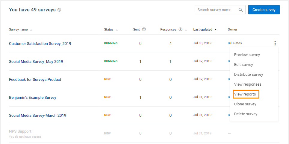
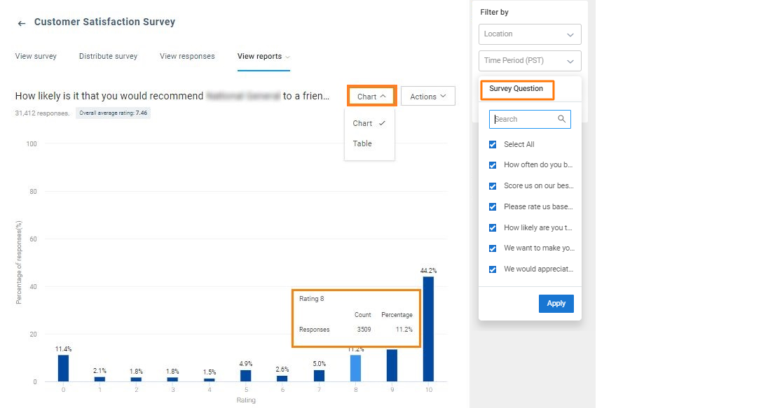
The Survey Results ‘By Question’ report shows the percentage distribution of responses for each question in the survey. Statistical information for each response choice is available. You can also choose to view between different question responses.
The report can also be viewed in a tabular format with the count and percentage for every response option.
The report is also available by question over a designated period of time and a by location comparison with drill down options for all.
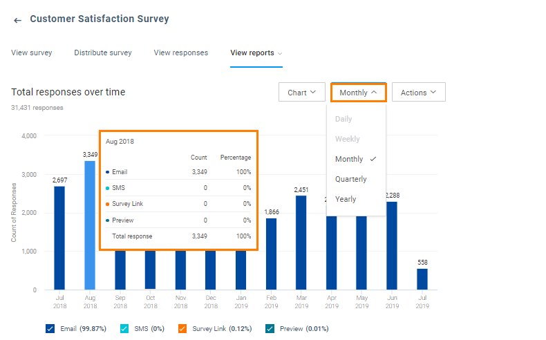
The Usage Reports ‘Overtime report’ displays the total responses over a period of time. You can hover over any bar to view the source channels of all the responses with the count and percentage distribution. You can always choose to view data basis ‘Daily’, ‘Weekly’, ‘Monthly’, ‘Quarterly’ and ‘Yearly’.
The report is also available by channel and a by location comparison with drill down options for all.
Ticketing Reports
Support tickets serve a variety of benefits right from addressing customer issues to creating best practices for future product development. With TrueVoice CX’s deep analytical tools, you can look at the speed and the professionalism of your customer service with a micro lens. TrueVoice CX automatically populates organized reports from your ticket support history and makes it available for you to take the best decisions to build the future roadmap for your business. The ‘Ticketing reports’ are classified under two categories: ‘Average resolution time’ and ‘Ticket count’.
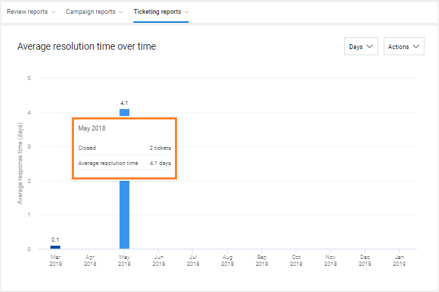
By default, the average resolution time over time report provides you with the average ticket resolution time in a day-wise distribution format. You can hover over any bar to read the statistical information. You also have the ability to view the information in a day/hour-wise distribution format.
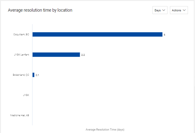
The report on average resolution time by location will help you monitor trends based on average resolution time for different locations associated with your TrueVoice CX account. You can hover over any bar to read the statistical information.
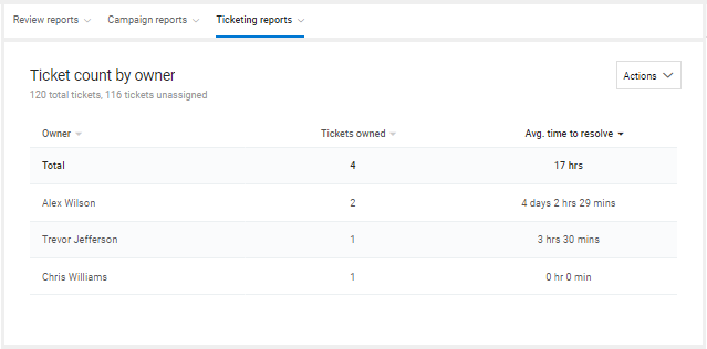
You can also view the report for the number of tickets resolved by owners associated with the TrueVoice CX account.
This report will help you view tickets resolved by different owners with the average resolution time for each owner.
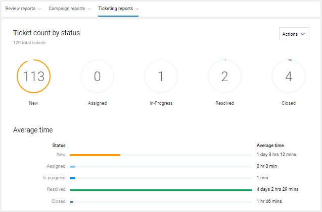
The final report gives you the total ticket count categorized under different statuses. On this page, you will be able to view the current status for total tickets created using the account.
